IBM Apprentice Database
The IBM Apprentice Database serves as a system of record for completion of the apprenticeship program. The apprentices are required to document their learning to meet requirements for the US Department of Labour.
The tool is functional but has received a low NPS from apprentices and mentors. I worked as a part of the UX team to refine the experience, leading to increased user satisfaction.
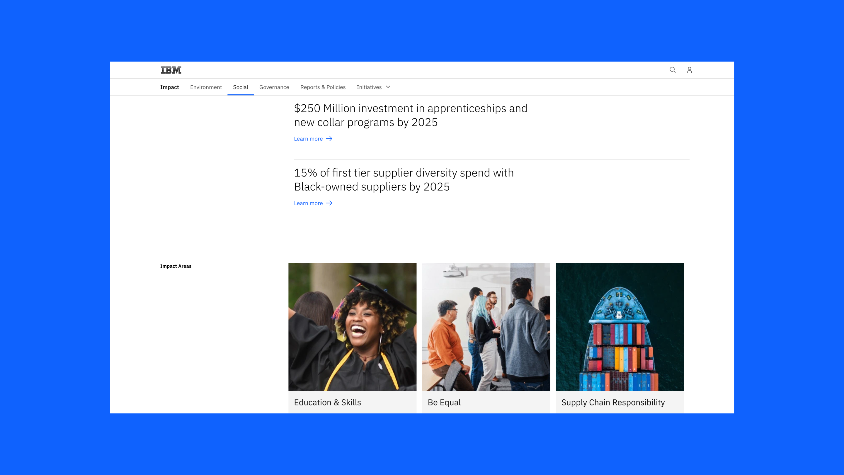
IBM is investing $250 million in apprenticeships and other new collar programs by 2025. It is part of one of IBM’s ESG (Environmental, Social, and Governance) goals, and investing in apprenticeships is a way for IBM to make an equitable impact by removing barriers to tech jobs while growing the talent pipeline.
Role:
UX Designer
Contribution:
Prototyping
UI Design
User Research
Team:
Josie Zuo Fengjiao
Lauren Scheck
Samantha Farias
Duration:
8 weeks
UX Designer
Contribution:
Prototyping
UI Design
User Research
Team:
Josie Zuo Fengjiao
Lauren Scheck
Samantha Farias
Duration:
8 weeks


How I solved the problem
What is IBM Apprenticeship
The apprenticeship is a workforce training model combining paid on-the-job learning and formal classroom or online instruction to help workers master the knowledge, skills, and competencies needed for career success. The 3 components of the apprenticeship program include mentorship, competency framework, and learning.

Meet Noel, a UX apprentice who’s eager to learn new skills
We conducted user interviews and developed a persona. Noel, a UX apprentice at IBM, is enthusiastic about learning new skills and contributing to the team's success. She seeks guidance from her mentor and manager to balance online learning with real projects and achieve her goal of securing a full-time position at IBM.

Key user challenges: documentation submission, database access, and mentor check-in
Based on the findings, we developed an as-is journey map to gain deeper insights into users' current experiences and pinpoint the key challenges to address. These challenges primarily center around issues such as checking in with mentors, accessing the database, and submitting documentation.

Apprentice pain points
Unclear homepage instructions:
The lack of clear instructions on the homepage leaves new apprentices feeling lost and confused. They struggle to understand the features and require extra effort to find what they need.
Extensive scrolling & expanding:
Different roles have specific work processes and competencies to complete, resulting in a lengthy list of up to about 90 items. When apprentices search for content to document, extensive clicking and scrolling are required, making it difficult to locate relevant materials.
Unclear documentation process:
The process of documenting learning experiences is frustrating and inefficient. Assessment criteria are separated from the submission form, leading to confusion. Unclear field requirements and technical formatting issues further hinder the documentation process, resulting in a low NPS.


Mentor (approver) pain points
Unable to access review page directly:
Mentors face difficulty when trying to review apprentice work after receiving an email notification. Clicking the link doesn't take them to the review page but to a general apprentice list. This requires manual searching to find the specific apprentice's work for review, making the process less efficient and more time-consuming.
Struggle to reference while reviewing:
Mentors must switch between pages or use an extra window to view assessment criteria during the review process of apprentices' work. Also, the terms 'mastery shortfall' and 'confirm evidence' confuse mentors, along with unclear button placement, causing hesitation and disrupting the assessment process.


“Create an interface that allows apprentices to easily document work processes and competencies through a seamless user interaction that increases user engagement.”
Based on the feedback we consolidated from user interviews, we created goals for each step users take to complete the process. Then, we concluded a design goal for this project.

Feature prioritization for an enhanced submission experience
After meeting with stakeholders to review user feedback and objectives, we prioritized features to assess feasibility, including:
- Filtered by submission status, due date, and name
- Submit learnings while viewing submission guidance
- Visual overview to see progress at a glance

Design explorations, from low-fi to high-fi

Solution
Highlighting progress on homepage
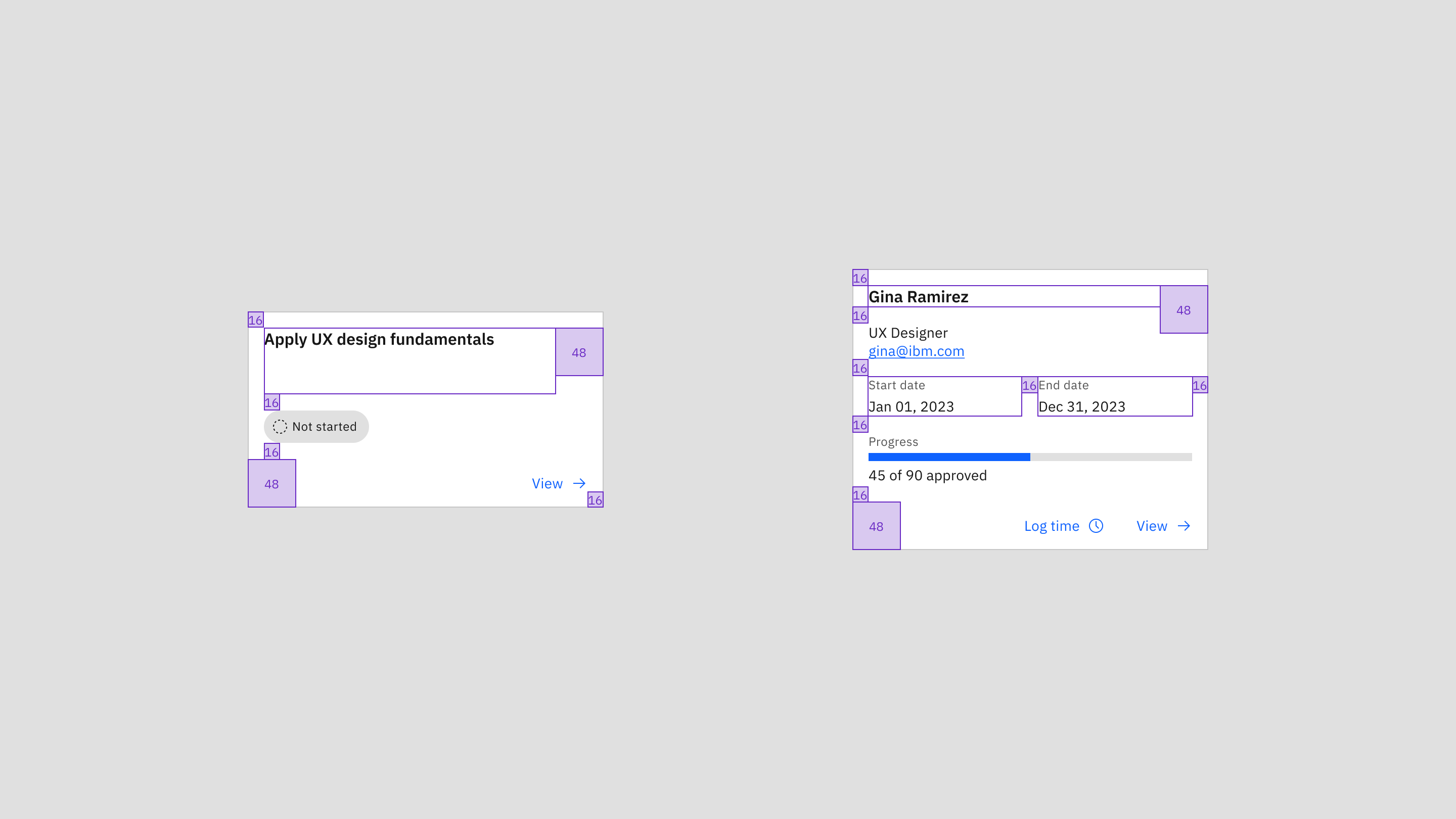
The apprentice homepage is a one-stop view for tracking their progress in the apprenticeship. It shows individual completions for tasks and competencies, eliminating the need to switch between tools. The homepage also highlights any outstanding items, making it easy for apprentices to pick up where they left off or quickly address resubmissions, leading to more timely completion of tasks.

Improving search & navigation with filter and grid system
The updated competency framework page addresses two issues with the previous experience: users struggling to quickly find content and facing navigation challenges due to a long scroll and extra clicks. The new design enhances searchability by enabling users to search by title and filter by status and type, facilitating a quicker and more focused search for apprentices. The layout is revamped from a list view to a tile view on a 4-column grid system, displaying more content on a single page and minimizing the need for excessive scrolling and clicking.

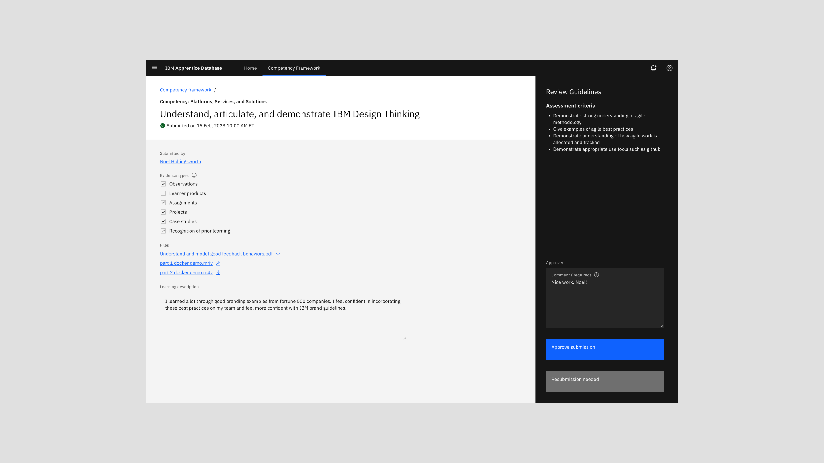
Providing clear submission & review guidelines
The new submission page offers clear and accessible guidelines alongside required fields with prominent indicators, empowering apprentices to submit their work with confidence and minimize errors. Approvers benefit from readily available review guidelines displayed on the page and unambiguous button labels, facilitating efficient and accurate assessments.

Quick submission review & apprentice management
The mentor homepage now features an apprentice submission review table, presenting items requiring the mentor's attention. This enhances the page navigation and task completion. Additionally, the homepage now displays the mentor's current apprentices. This provides a quick overview of each apprentice's contact details, program start/end dates, and their progress.

User testing: positive user satisfaction compared to previous design
Due to time constraints, we opted for a Likert-style survey to validate the designs. The new competency frameworks page demonstrates a significant improvement, with score increasing from 2.67 to 4.33 out of 5. Also, the homepage receives a score of 4.67 out of 5, marking a +62% improvement in user satisfaction. This indicates a positive response and heightened user satisfaction compared to the previous design.
