Currenxie Web App & Mobile App
Currenxie /’kur-uhn-see’/, a Hong Kong-based fintech company offering a one-stop finance app for international business payments, partnered with Visa to launch a corporate card. However, their existing mobile app, limited to Android and lacking key features like money transfers, hindered user engagement and wasn't ready to support the new card. To address this challenge and capitalize on the Visa partnership, I redesigned the web and mobile apps, creating a unified experience that empowers users to manage spending, cards, and transactions seamlessly across all platforms, while reflecting Currenxie's fresh brand identity.
The redesign led to a surge in user engagement, positive reviews, and increased money transfers and app downloads. These improvements culminated in Currenxie securing a $10M Series A funding round, demonstrating strong investor confidence in the platform's future.
Role:
Lead designer
Contribution:
Design System
UI Design
User Research
Team:
Fahd Kasri
Kris Gerardsso
Mariem Ben Ayed
Sam Coyne
Tatiana Filippov
Duration:
18 months
Lead designer
Contribution:
Design System
UI Design
User Research
Team:
Fahd Kasri
Kris Gerardsso
Mariem Ben Ayed
Sam Coyne
Tatiana Filippov
Duration:
18 months


How I solved the problem
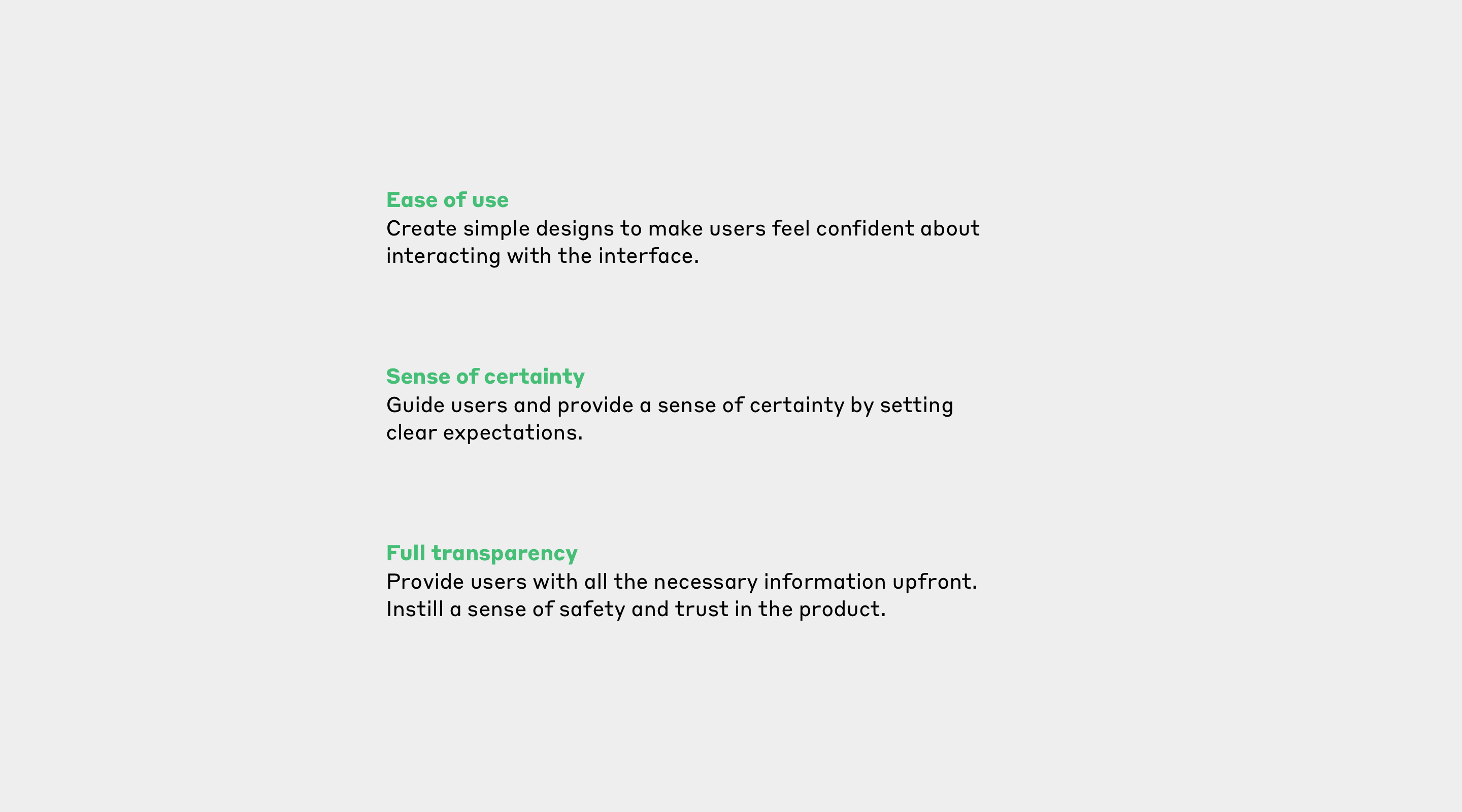
Setting up guiding principles to define success
To start the process, I worked with Marketing and Product Owner to create guiding principles to define success based on the new marketing and product strategies.
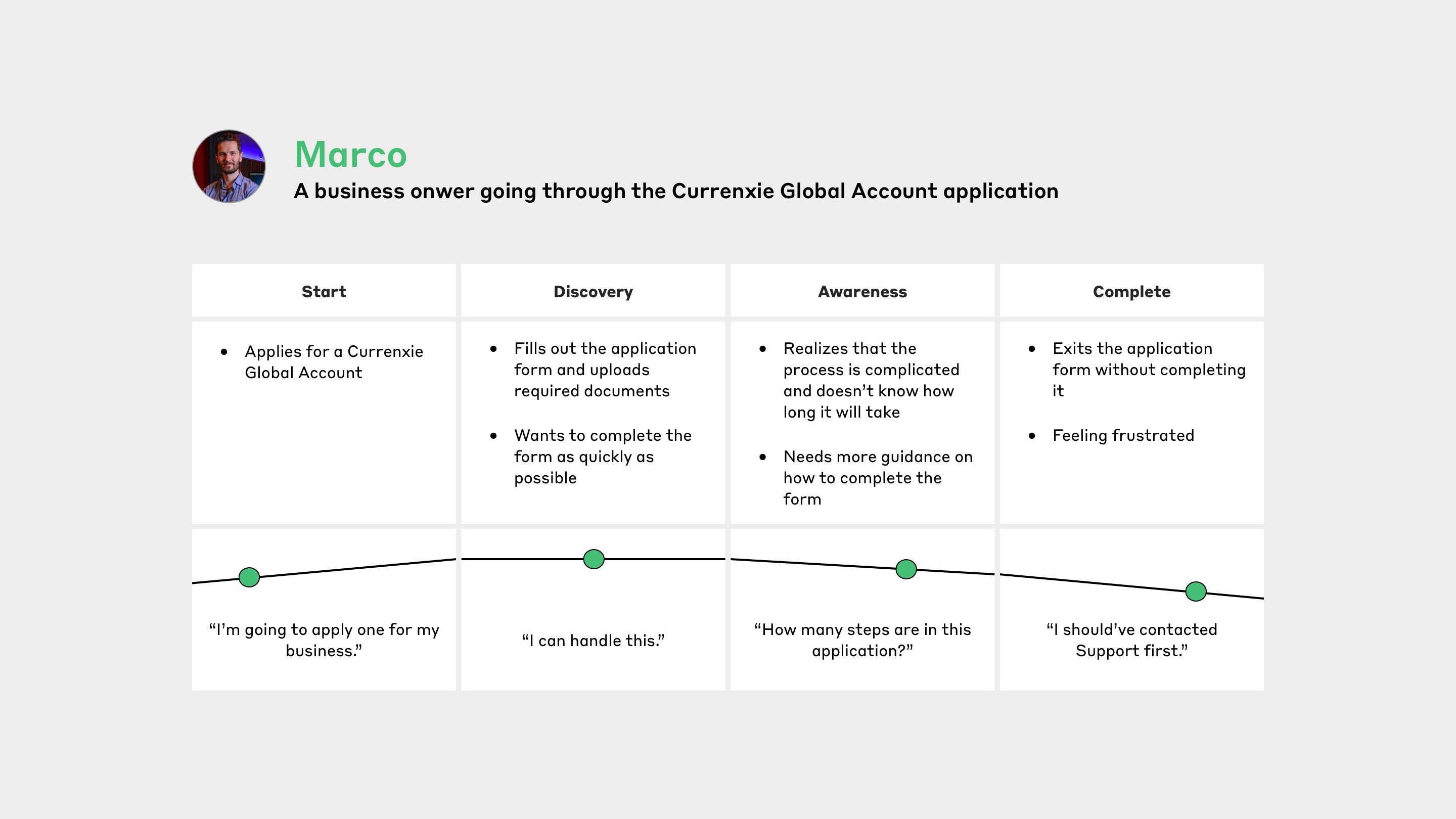
Journey map: uncovering the need to streamline application forms
Applying for a Currenxie Visa card requires a pre-existing Currenxie Global Account, or users need to go through a separate application and account approval process. It's complex, lacks guidance, and offers no timeframe for completion. Understanding these pain points helps inform the Visa card application and streamline the existing Global Account application process, creating smoother user experiences.
User flow: discovering key information user needs
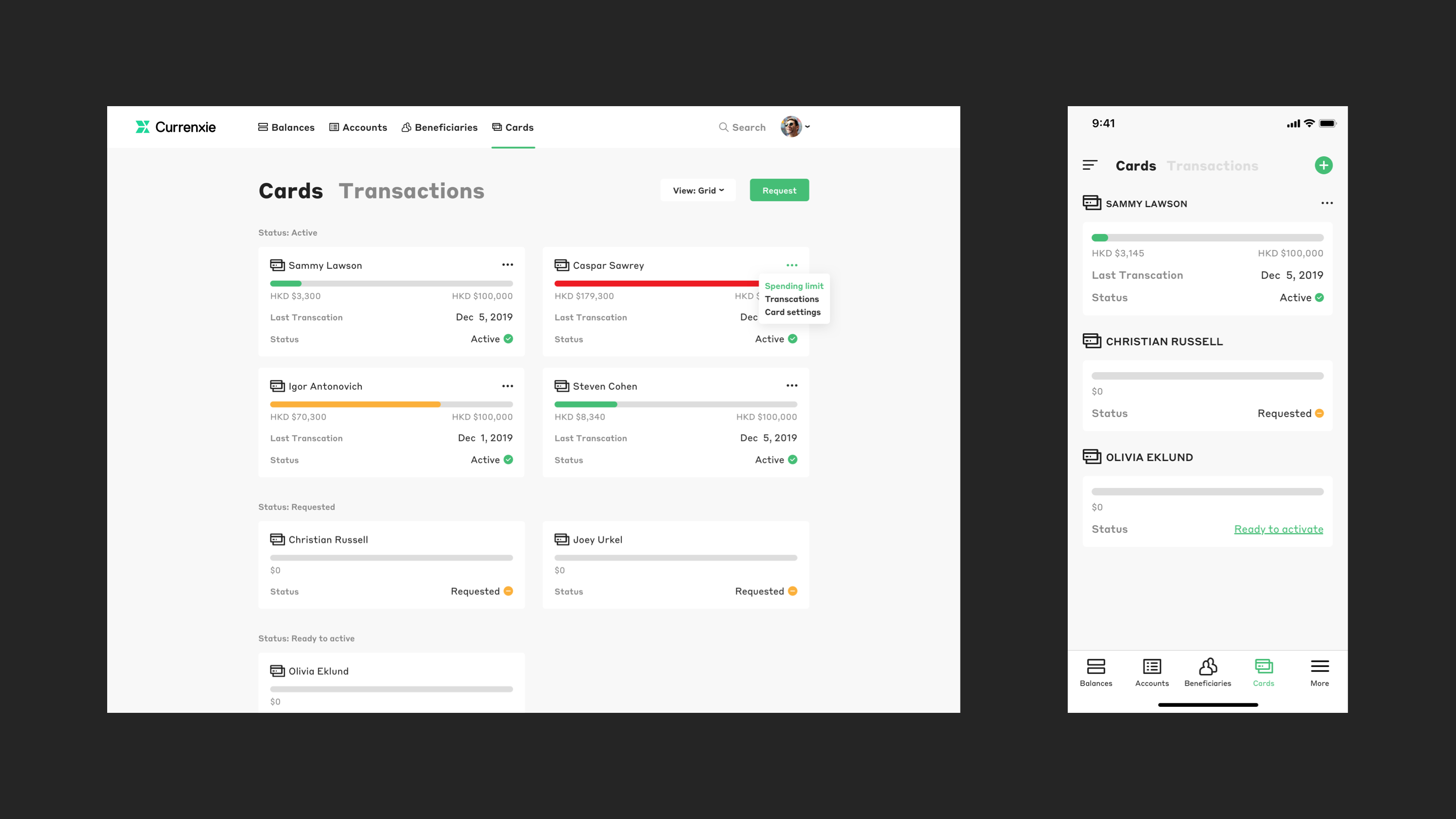
To gain a holistic view of the Visa card application process, I created user flows for admin users. Through this analysis, I learned the key information admin users prioritize: application status, date, cardholder details, and transaction amounts.
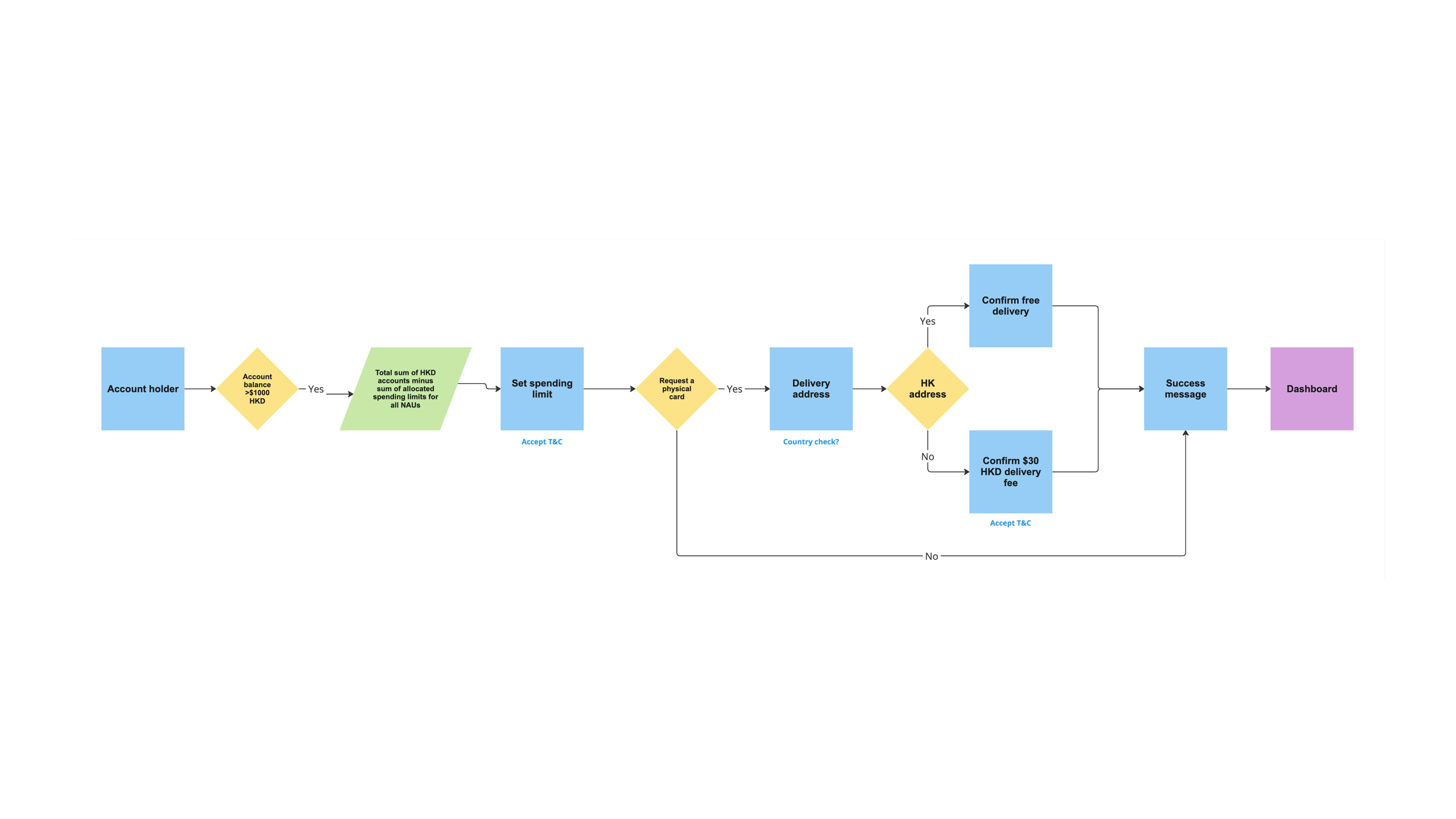
Design exploration: prioritizing core functionalities
I began creating designs to help stakeholders and leadership visualize the real-world application of the new features. Based on several discussions, the team decided to prioritize core functionalities and remove FX rates as they were not considered essential for the MVP.
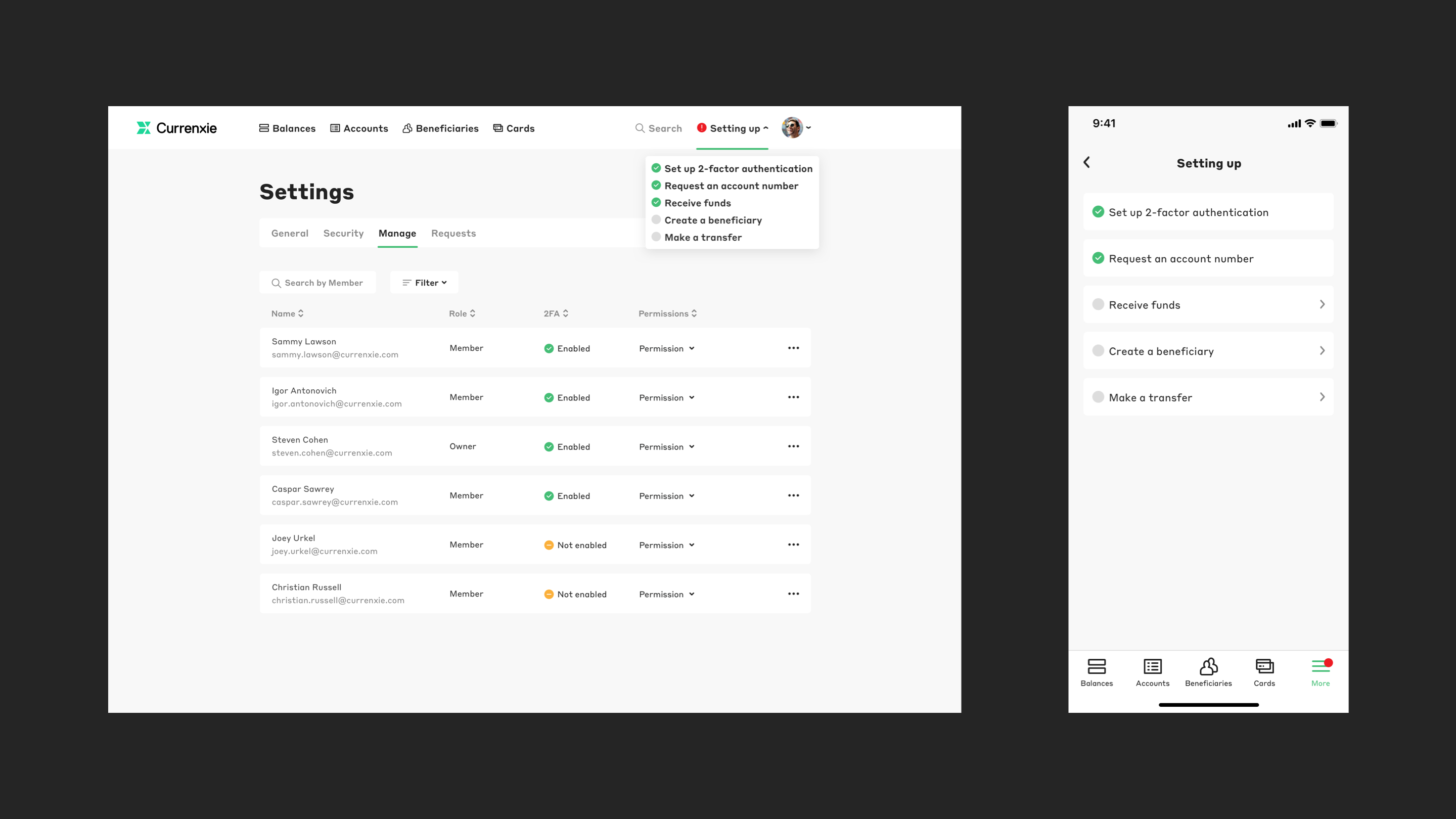
Testing & iteration: Replacing confusing icons with dropdown menu
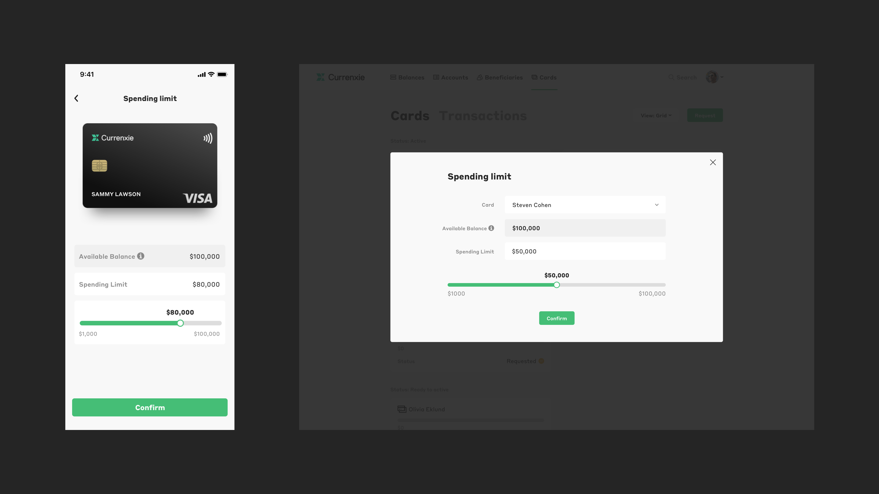
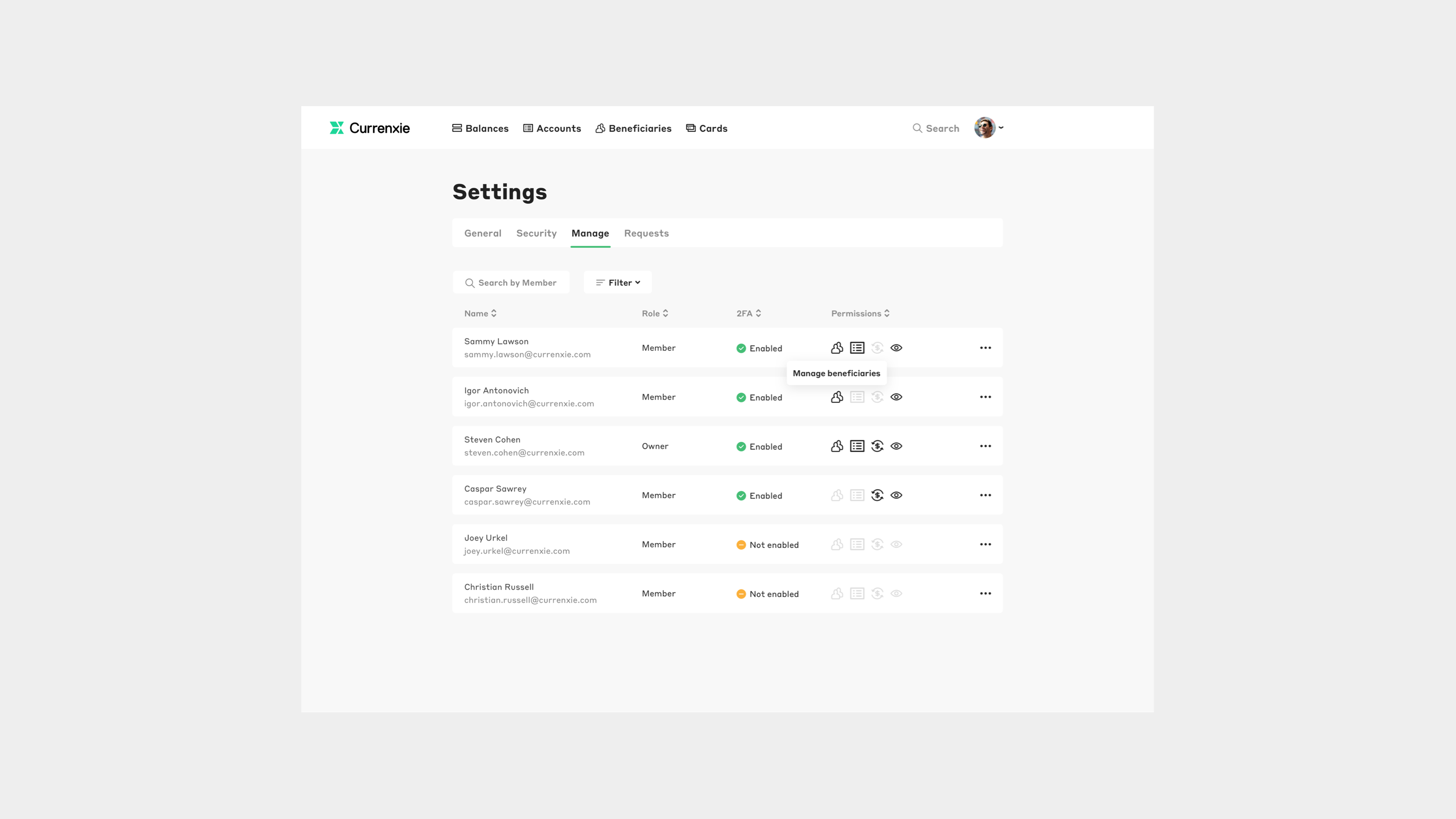
User testing with existing select clients showed challenges managing cardholder permissions in settings. Participants expressed confusion about the icons. To address this and expedite development, I replaced them with a dropdown menu, aligning with our goal of minimizing user time spent making permission changes.

Solution
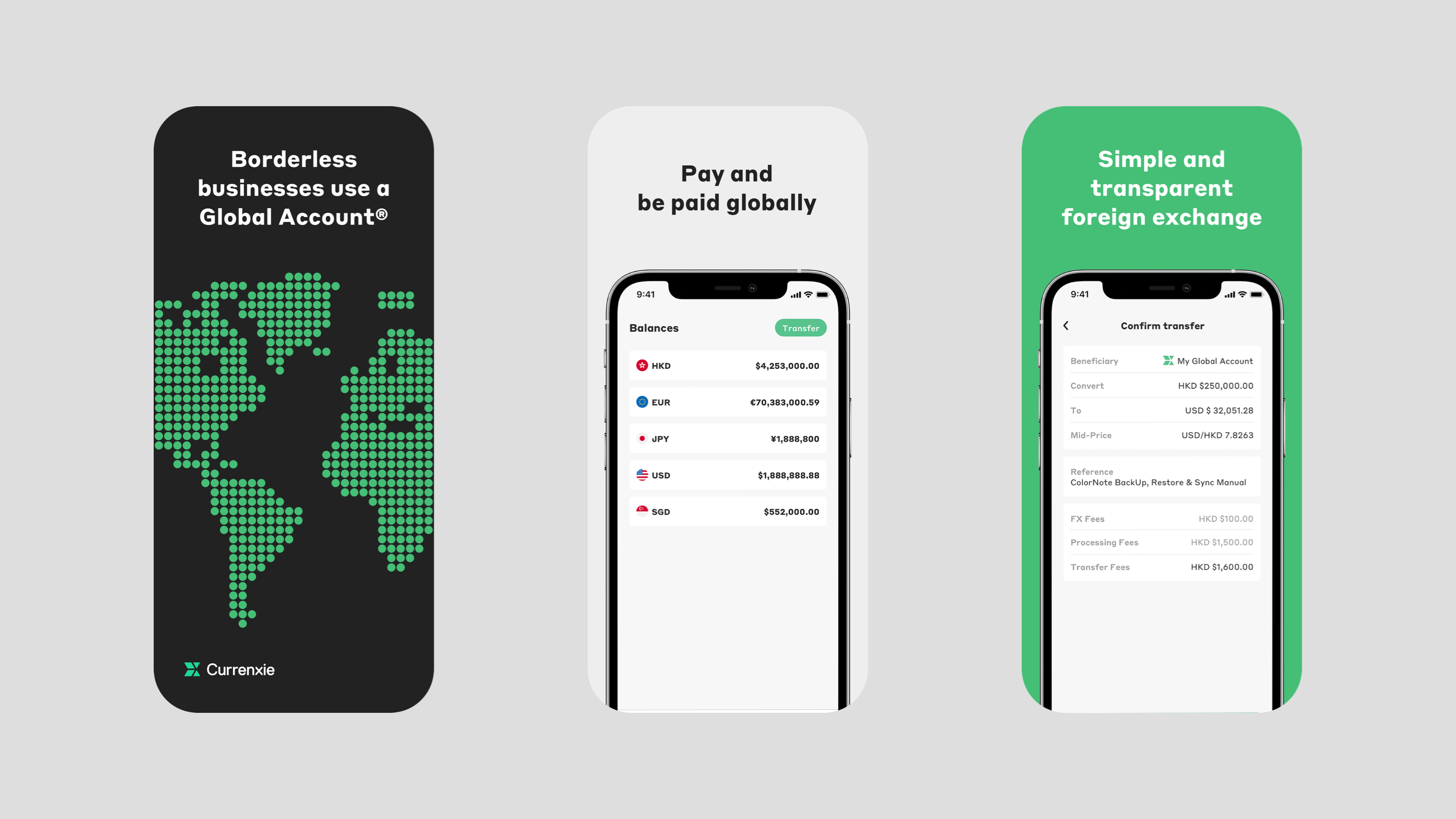
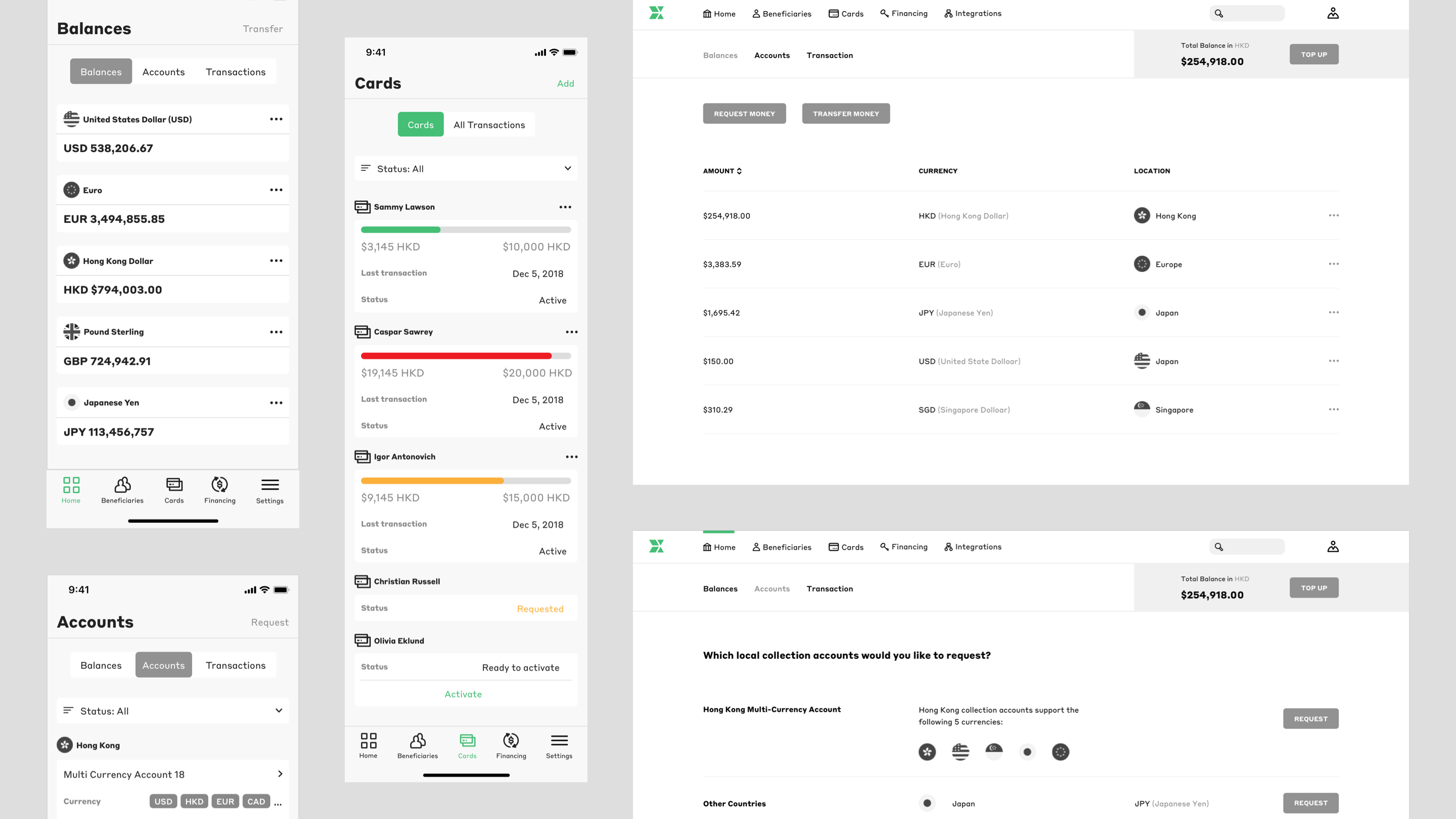
Highlighting key data with minimal visual density
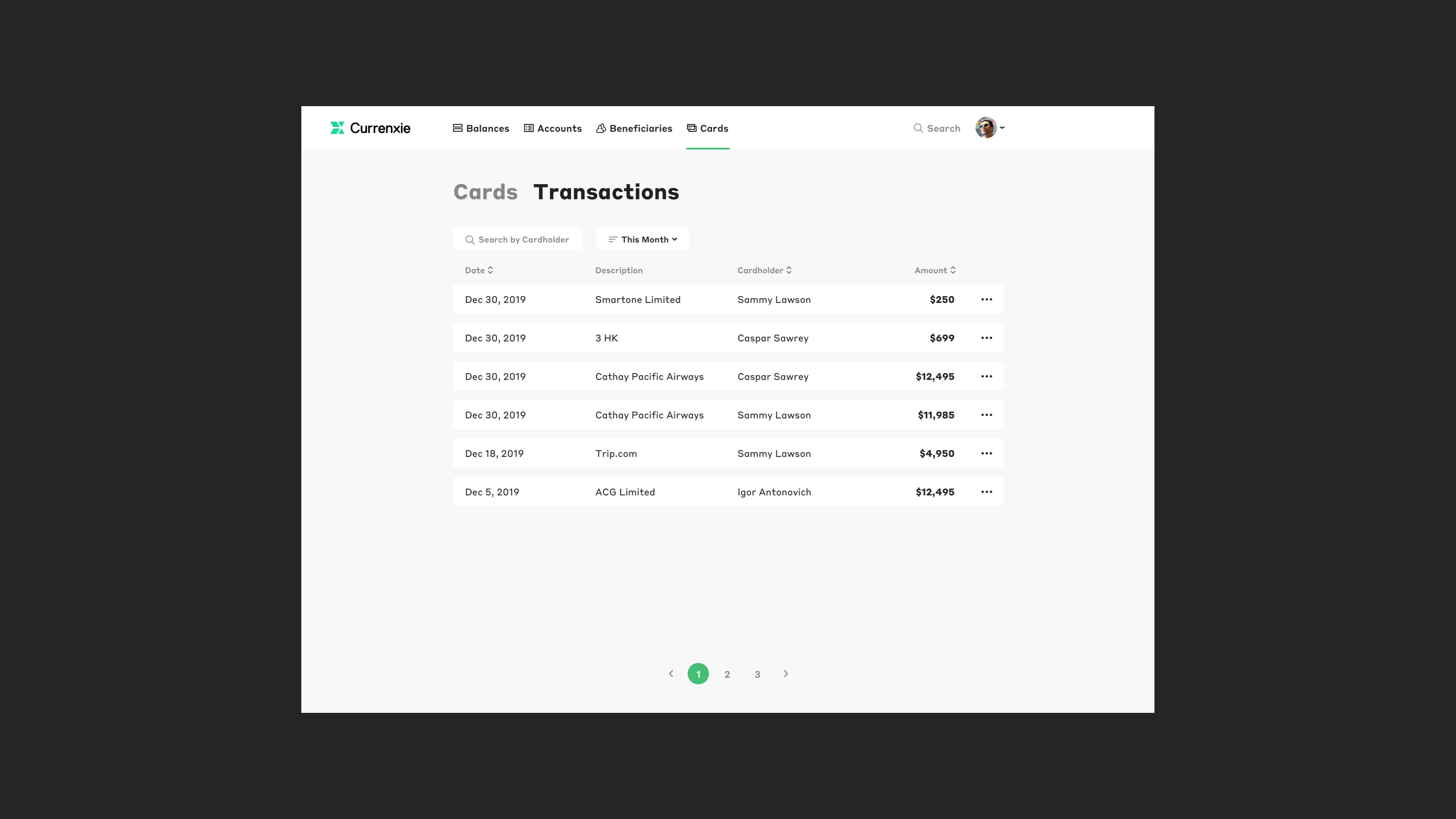
To help users better monitor transactions of each account, I highlighted key data using a minimal visual density by showing what is essential—status, date, cardholder, and amount. I also added a color-coded spending indication. It requires less effort for users to process information and provides visual clarity.

Building trust through transparency
To maintain user trust and avoid confusion, I implemented transparent fee structures. By clearly displaying fees upfront, before a transfer is initiated, users are informed of all charges associated with the transaction. This eliminates last-minute surprises and fosters a sense of trust and clarity in the user-business relationship.

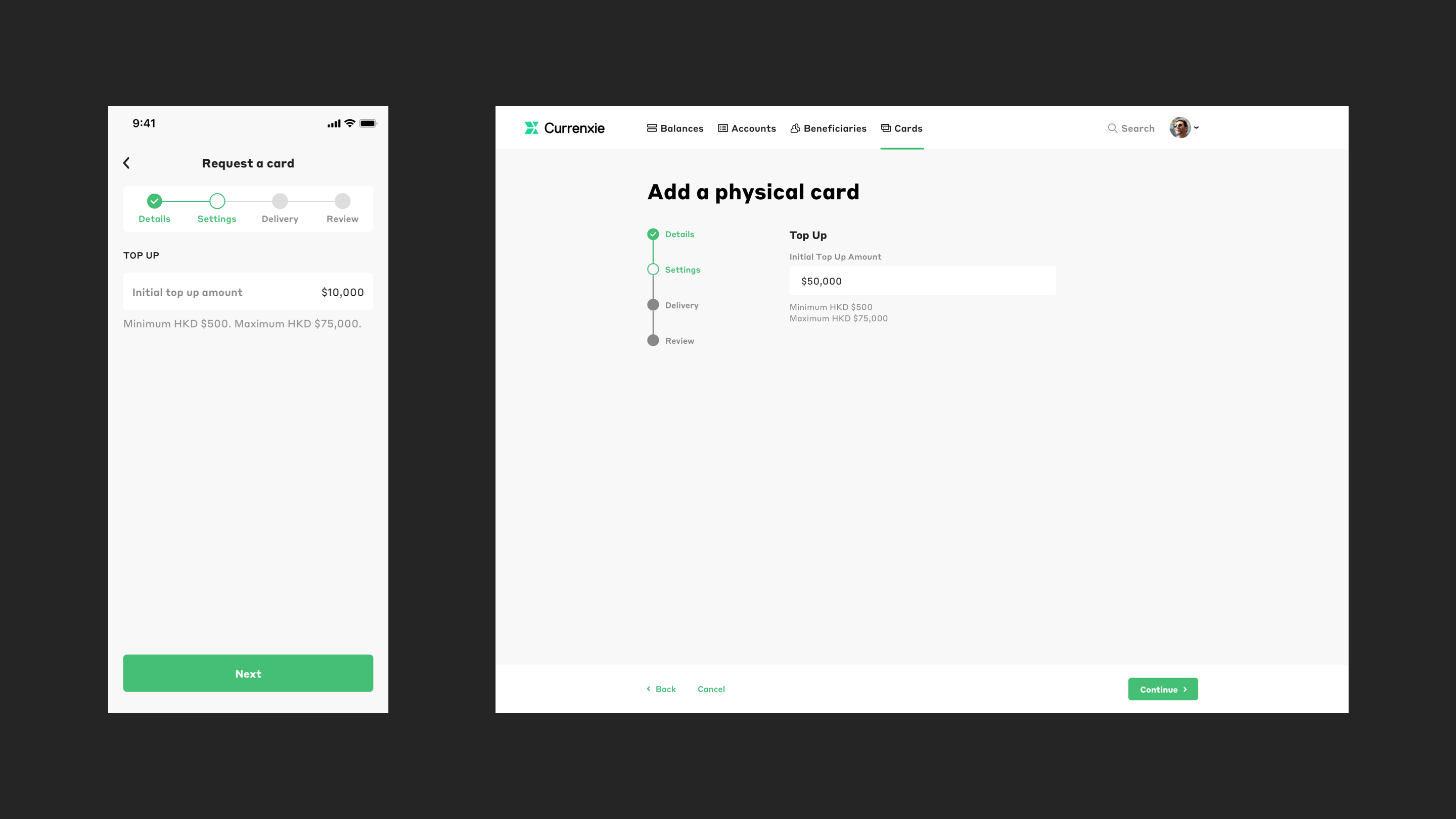
Simplifying application journey with progress tracking
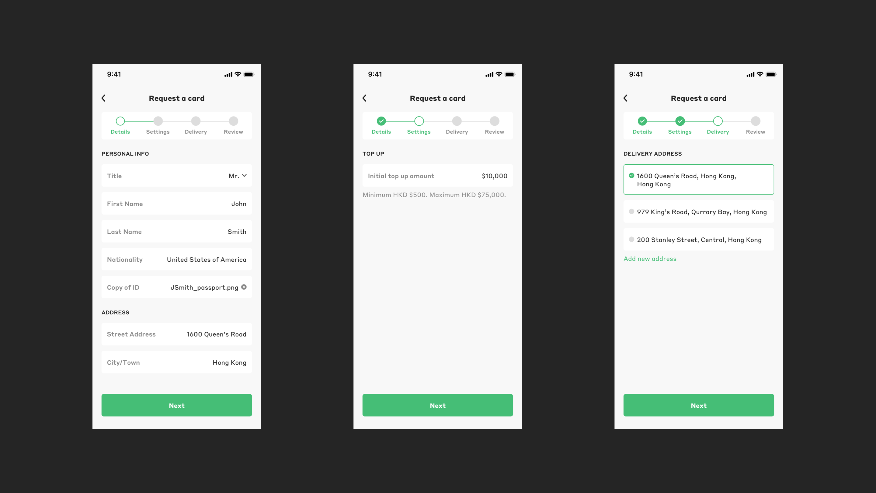
To streamline the application process and manage user expectations, I implemented a 4-step breakdown with a progress bar. This upfront transparency informs users of the application steps before they begin, and the progress bar allows them to track their progress throughout, minimizing confusion.
Scaling brand guidelines into design systems for consistency and collaboration
To facilitate better collaboration and project hand-off, I expanded the brand guidelines of the website into a component library. This also ensures that the cross-device experiences are seamless for users.
