Currenxie Brand & Website
Currenxie /’kur-uhn-see’/ offers a one-stop app for payments, currency exchange, and virtual accounts, streamlining international finance for businesses. However, an outdated brand, a bootstrap-themed website, and generic stock images all failed to reflect their innovative approach and hindered growth and brand connection. A brand refresh and website redesign were needed to bridge the gap and reflect its updated brand identity.
I led a rebrand that embodied reliability, innovation, and modernity, reflected through a website redesign that strengthened brand experience and content discoverability. This resulted in a doubled session duration, 50% traffic increase, and 15% conversion boost. Additionally, I established a brand-aligned design system to optimize development and team collaboration.
Role:
Lead designer
Contribution:
Art Direction
Brand Identity
Visual Design
Team:
Fahd Kasri
Kris Gerardsson
Sam Coyne
Tatiana Filippova
Duration:
6 months
Lead designer
Contribution:
Art Direction
Brand Identity
Visual Design
Team:
Fahd Kasri
Kris Gerardsson
Sam Coyne
Tatiana Filippova
Duration:
6 months


How I solved the problem
Learnings from industry leaders: opportunity to leverage social proof to increase engagement
I analyzed competitor websites like Airwallex and Revolut. Key takeaways include produt snapshots for quick grasp of functionalities and benefits. Notably, none of the competitors prominently featured testimonials, a potential opportunity to leverage social proof and build trust, further impacting user engagement and conversion rates.

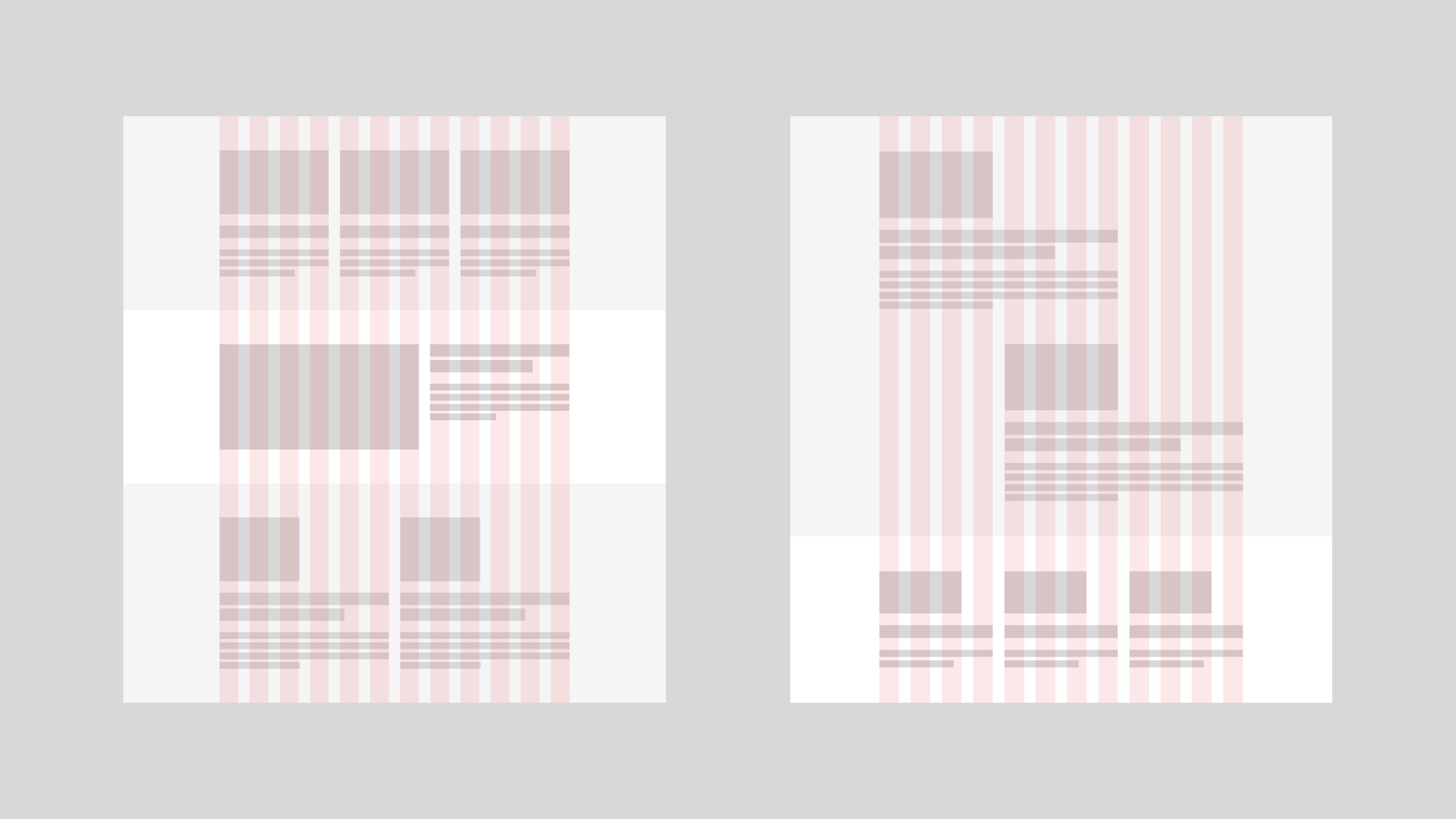
Revamping sitemap for clarity
After a thorough analysis of existing website structures and conducting in-depth desk research, I've created a sitemap for the new website, outlining the hierarchy and organization of all the pages.

Developing design concepts to address identified problems
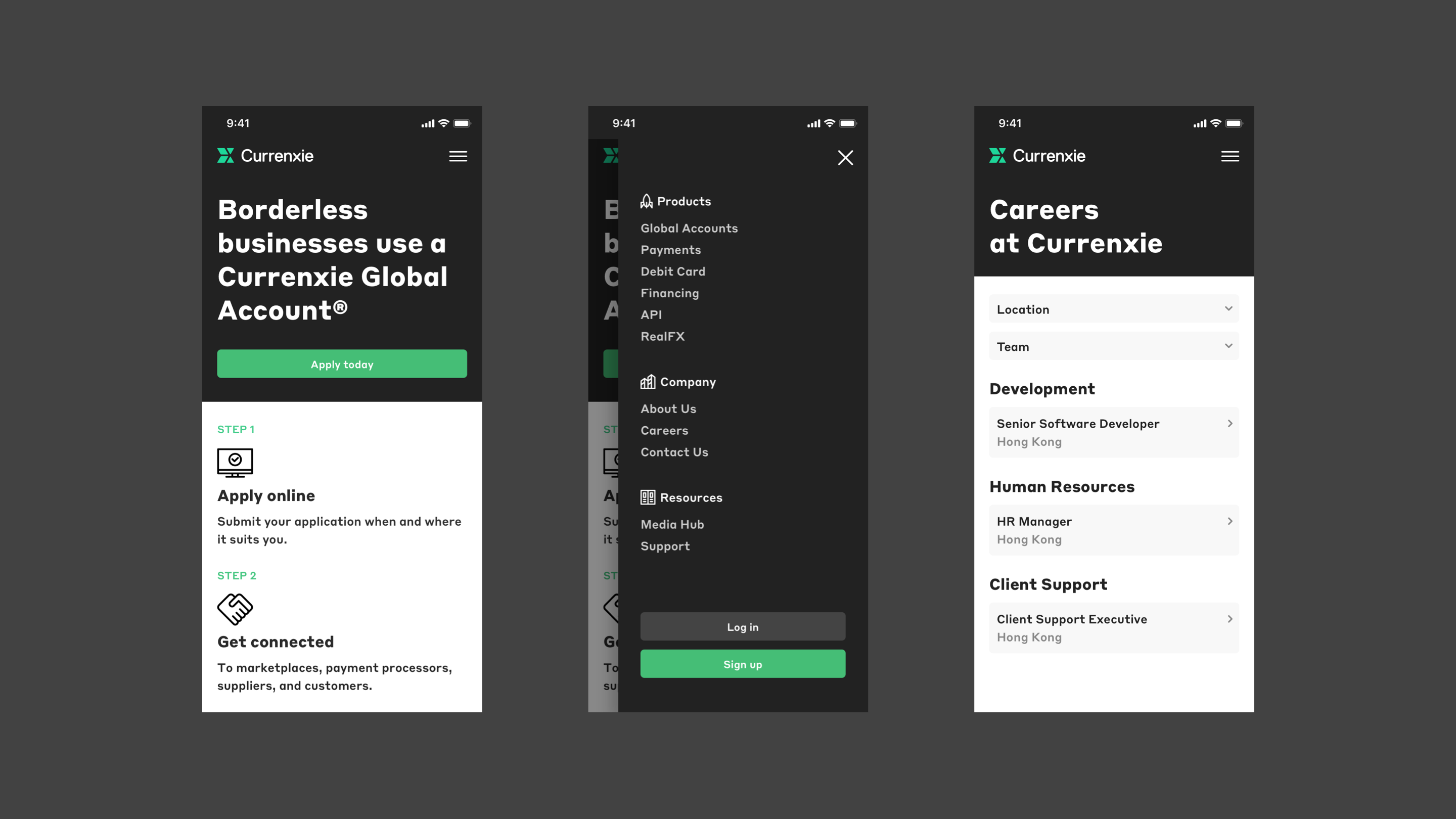
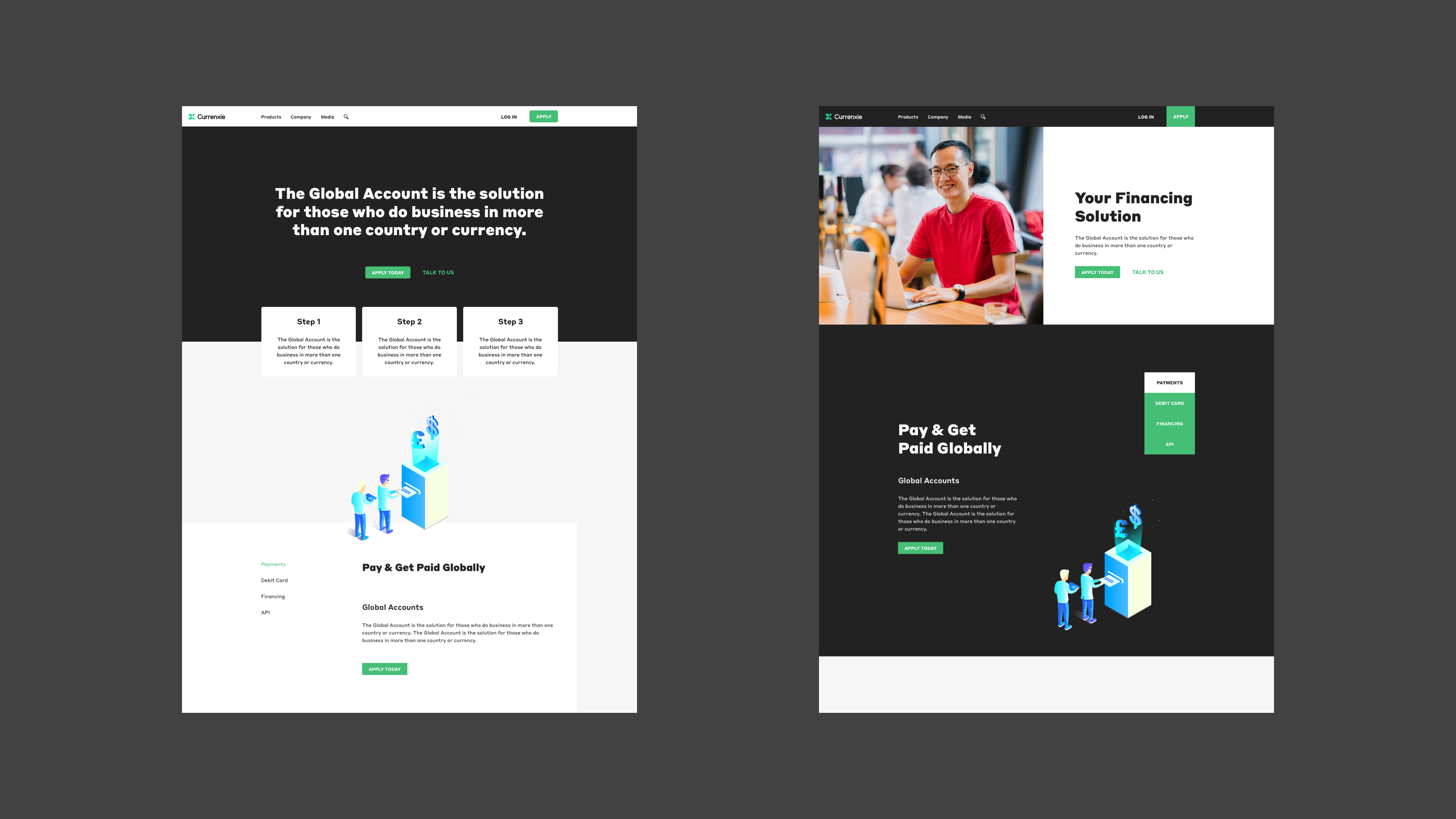
Streamlined feature introduction:
Clear step process introduces the main feature, facilitating user understanding.
Industry leadership showcase:
Curated client list highlights Currenxie's leading position in the industry.
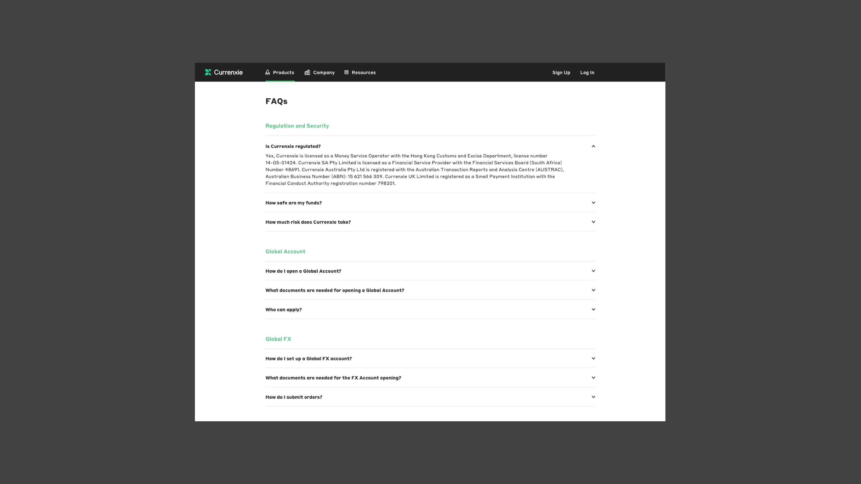
Enhanced user support:
Structured and detailed FAQ section with clear searchability helps users locate answers quickly.


User testing: faster completion, fewer errors, and higher satisfaction
I conducted a moderated user test to assess the usability of different design approaches. Key metrics included completion rate, user error rate, user satisfaction. The results showed option A to be significantly faster and easier to use, resulting in fewer errors and higher satisfaction among participants.
Solution
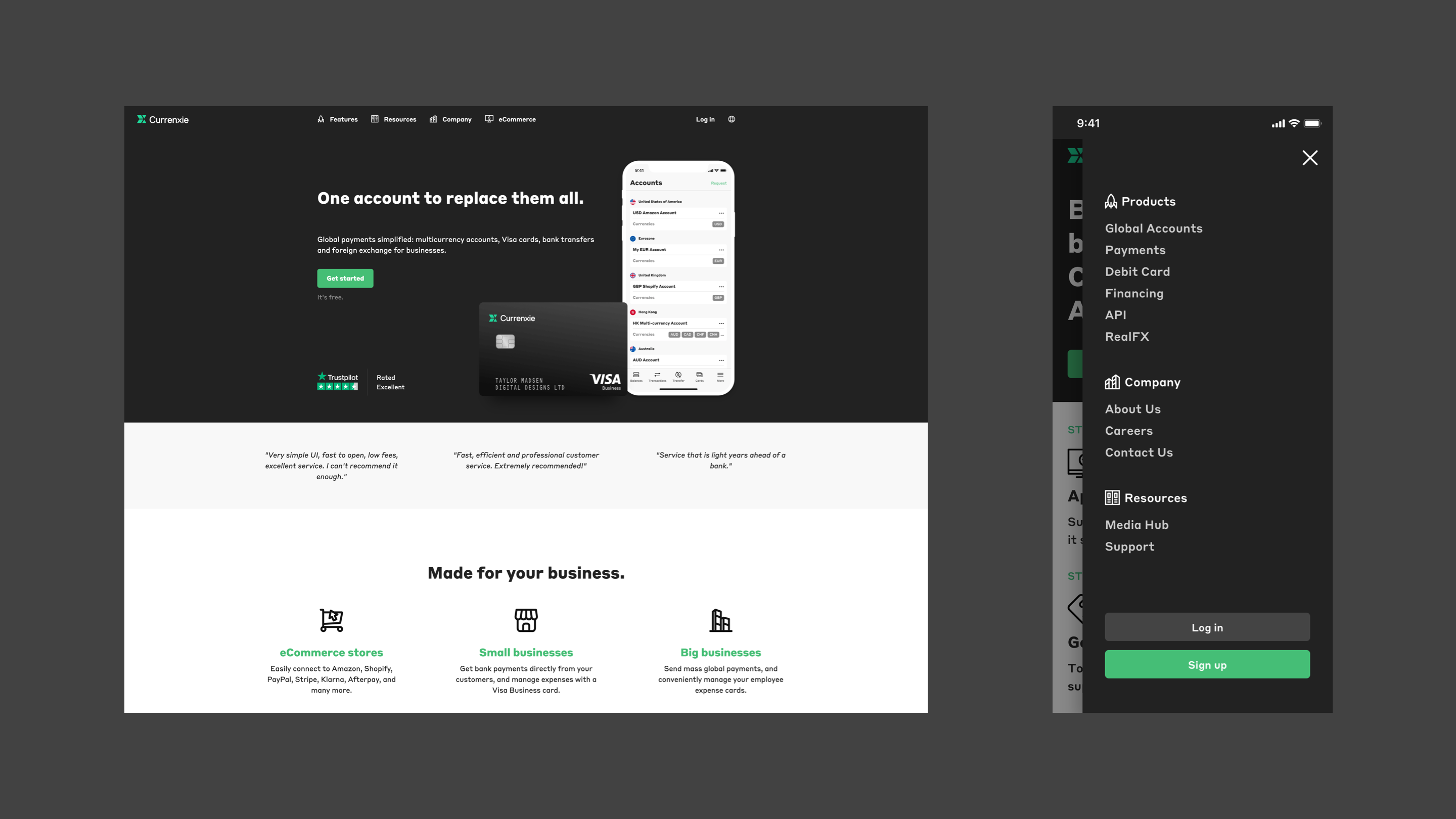
SEO-focused homepage and enhanced value proposition
I improved SEO for the homepage by relocating signup steps to the product page. To enhance Currenxie's market reputation and articulate the benefits of account opening, I added a Reason-to-Believe (RTB) section, strengthening the value proposition.
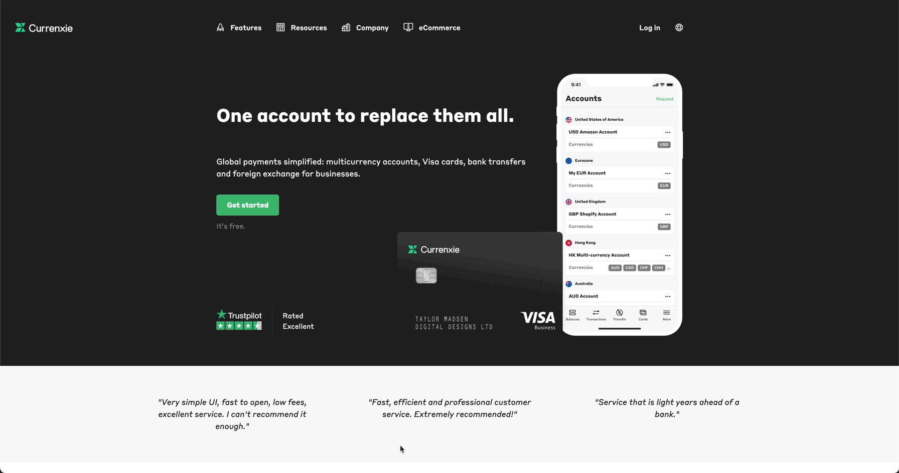
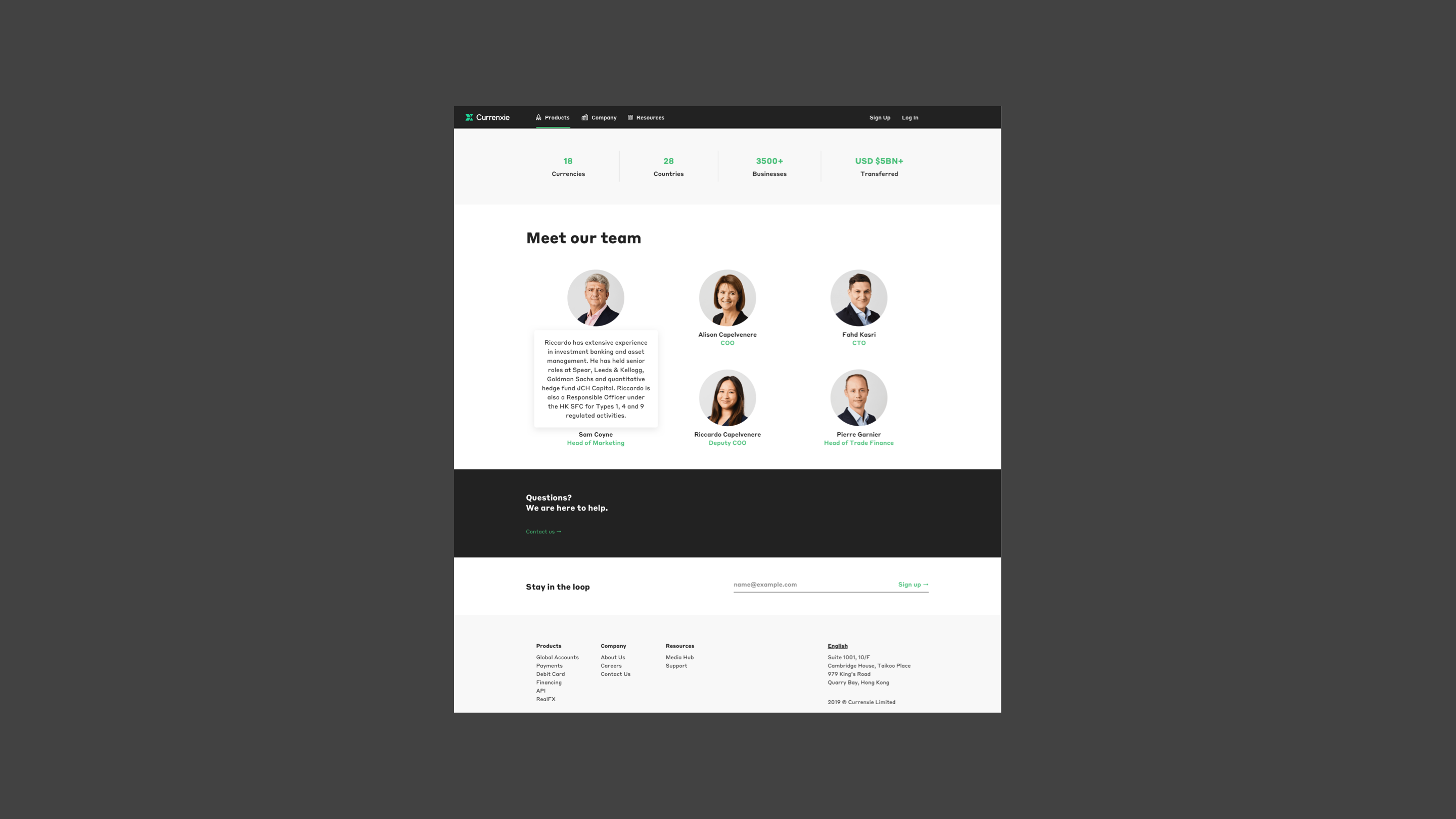
Building trust and community with testimonials
As a growing company, building trust was key for Currenxie. I prioritized reviews and testimonials above the fold, giving users access to real feedback and fostering a sense of community.

Easily accessible FAQs
A clear FAQ section is added to the homepage and certain pages to provide quick answers, improving user experience by promoting easy navigation.
